Design of a Web Blog
What is a responsive site?
A responsive site is a site that adapts to a users screensize and/or the changing of any browser sizing.
What is mobile first design?
Mobile first is a desgin approach which advises that desgining for smaller screens first and then adding additional material for larger wider screens is the way to do it. It's often a good idea because it forces the dev to prioritize the important information for the user by utilizing space on the smaller scree.
What is a framework?
A CSS frame work is simply a style sheet which is creates new rules and allows the dev to look at the divs in a different, usually simpler way. They're a great tool for devs but websites do end up looking similar if they're all using the same framework.
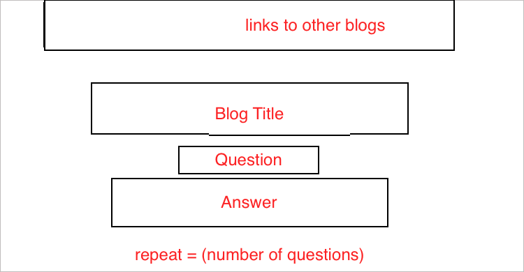
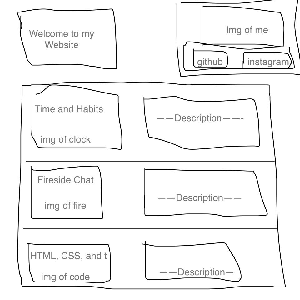
What is a wireframe?
A wireframe is a design layout which breaks a site down into divs/boxes. They're extrememly helpful as a guide for the dev to make sure they know exactly what they're trying to make.
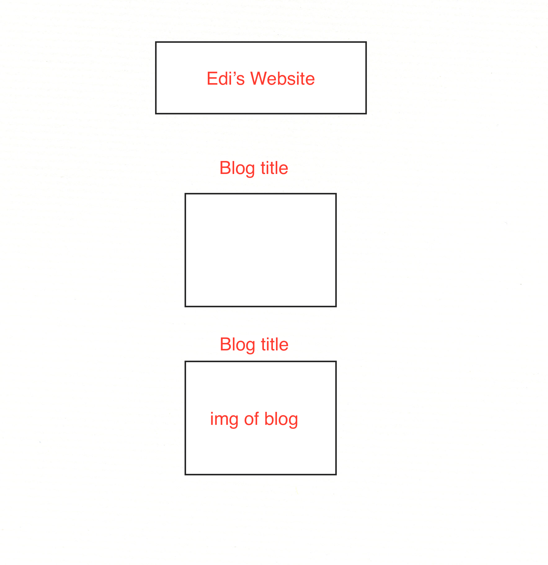
Which aspects of your wireframe were hard to implement?
I got severly blocked for a few days while using skeleton, as a result my current index page is not what I wanted and it is in my opinion worse than it was. I have been having a hard time resizing my imgs when they are in a skeleton container. I think the skeleton stylesheet is overriding my main.css